UI를 여행하는 디자이너를 위한 안내서 - 버튼 (Button)
디지털 세계에서 사용되는 사용자 인터페이스 중 버튼에 대한 모든 것을 알아봅시다.
버튼 UI의 역사
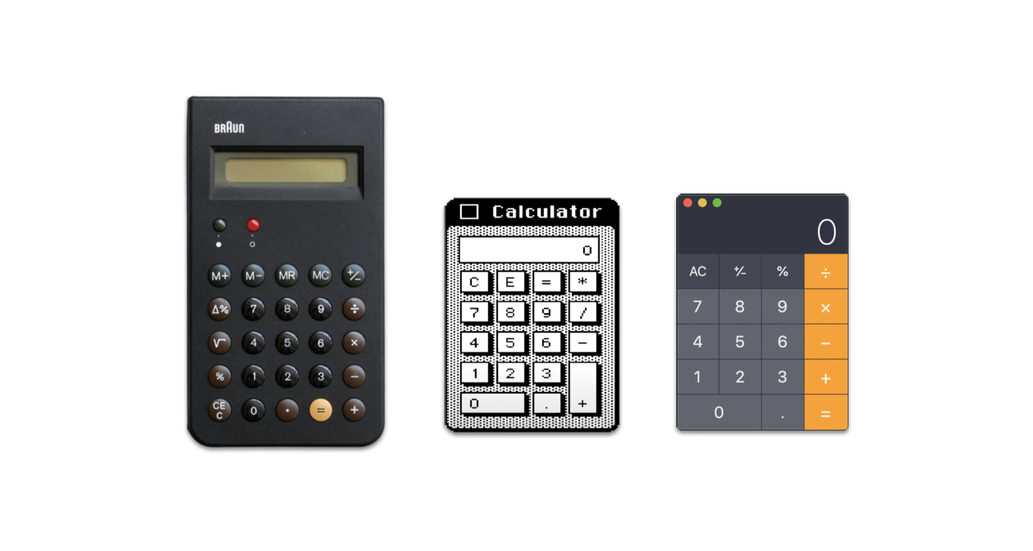
- 아날로그 버튼 → 디지털 버튼
- 디지털 버튼의 변천사 Pixel > Aqua > Skeuomorphism > Ghost > Flat > Material > Neumorphism > What’s next ???
버튼 UI의 구성요소
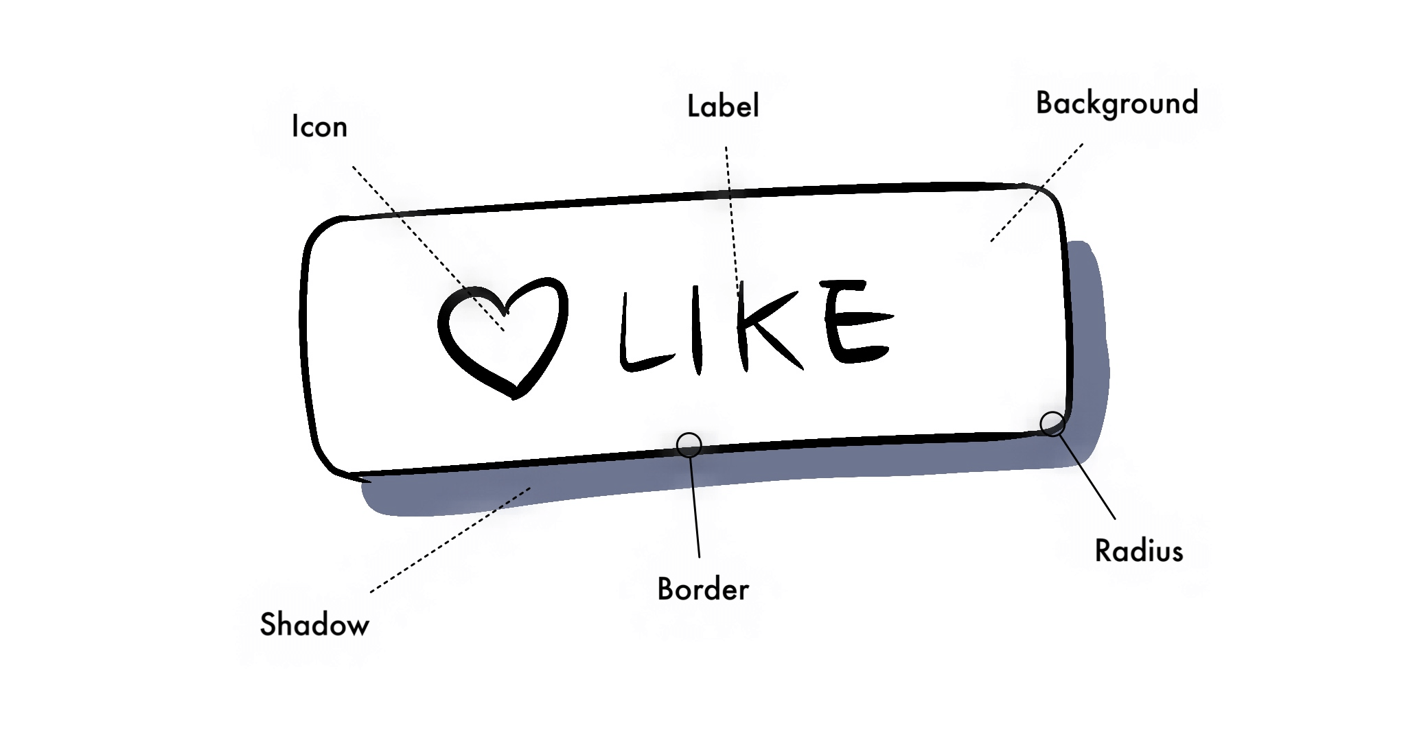
- 아이콘(Icon): 아이콘은 아이콘임 ㅇㅇ
- 라벨(Label): 레이블, 상표, 문구, 버튼 텍스트 라고도 함
- 배경(Background): 빽그라운드, 백그라운드, 삐지(BG), 컨테이너(Container)라고도 함
- 경계선(Border): 보더, 아웃라인, 윤곽선, 외곽선이라고도 함
- 반지름(Radius): 버튼 둥글기, R값이라고도 함
- 그림자(Shadow): 쉐도우, 그림자라고도 함
버튼 UI의 상태
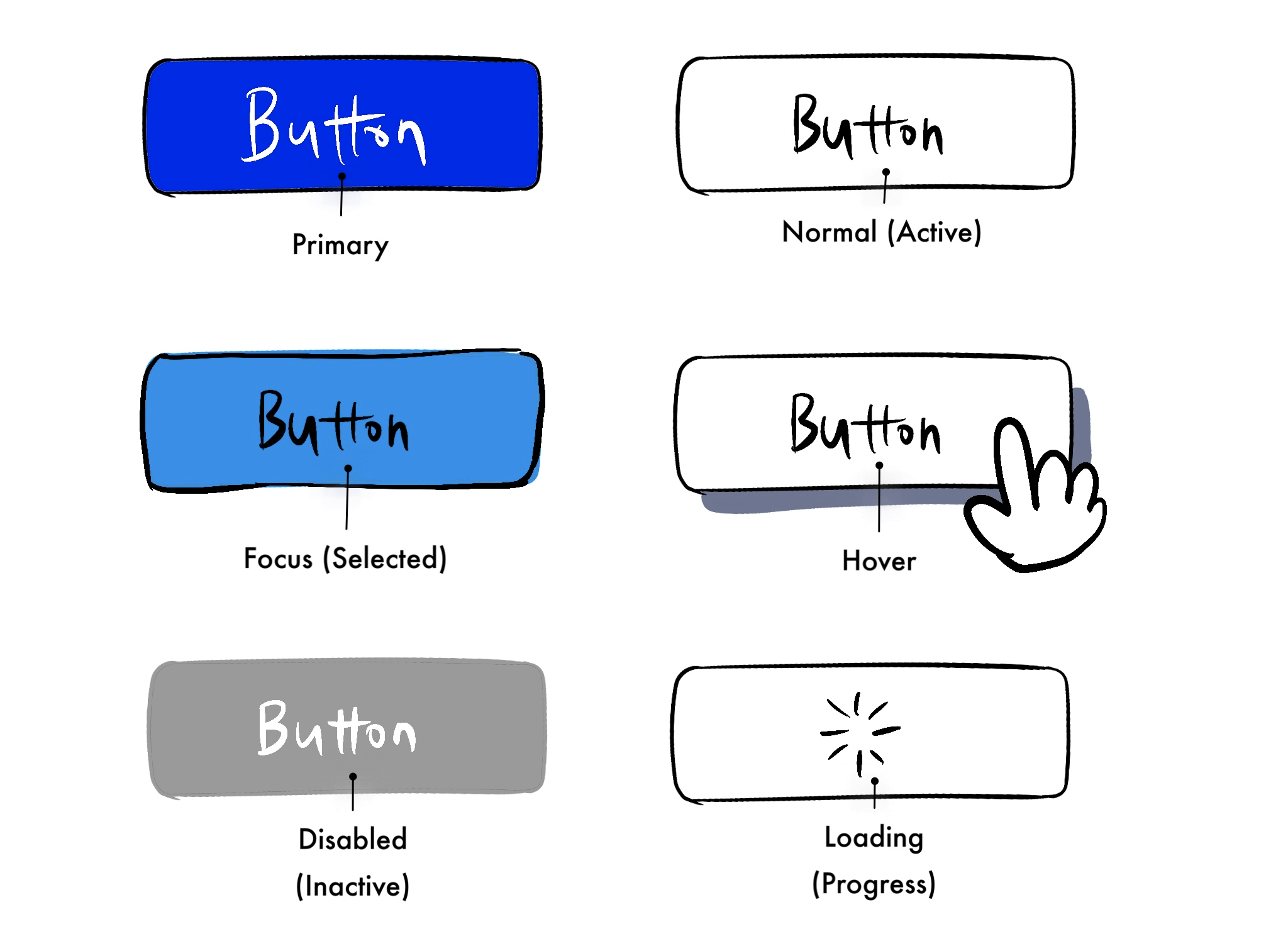
- 프라이머리 (Primary): 제일 중요한 버튼 (한 화면에 한 개만 사용하기)
- 노멀 (Normal): 기본(default), 디폴트, 활성, 액티브(Active)라고도 함
- 포커스 (Focus): 셀렉티드(Selected), 프레스드(Pressed)라고도 함, 버튼이 선택된 상태를 표시함
- 호버 (Hover): 마우스오버(Mouse Over)라고도 함, 마우스나 커서를 버튼에 올렸을 때 상태 변화를 알려 줌, 주로 그림자나 크기 변화로 표현함, 디지털 UI에서만 사용됨
- 비활성 (Disabled): 인액티브(Inactive) 버튼이라고도 함
- 로딩 (Loading): 버튼 내에서 로딩되는 과정을 알려줌, 디지털 UI 에서만 사용됨
버튼 UI의 스타일
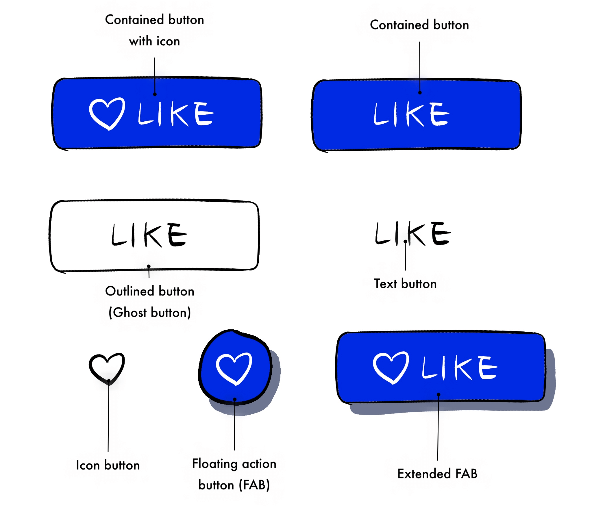
- 버튼 (Contained button): 컨테인드 버튼이라고도 함
- 아이콘이 포함된 버튼(Contained button with Icon)
- 아웃라인 버튼(Outlined button): 고스트 버튼(Ghost button)이라고도 함
- 텍스트 버튼 (Text button)
- 아이콘 버튼(Icon-only button)
- 플로팅 액션 버튼(Floating action button = FAB): 팹, 에프에이비, 플로팅 버튼이라고도 함
- 확장된 플로팅 액션 버튼(Extended FAB)
버튼 UI 디자인 잘 하는 법
- 버튼처럼 보이게 만들어라 (Don’t make me think)
- 버튼의 기본 상태 값(default)와 위치는 그때 그때 다르다
- 일관된 스타일로 사용해라
- 중요도에 따라서 사용해라 (Primary > Secondary > Tertiary)
- 누르기 쉬운 크기로 사용해라
- 접근성을 지켜서 사용해라
- 널리 퍼진 제스쳐를 고려해서 사용해라
- 라벨(Label)을 잘 사용해라
- 비활성화 버튼은 되도록 쓰지 마라
- 링크와 텍스트 버튼을 구별해서 사용해라
- 링크 텍스트: 다른 화면으로 이동 시 사용 (더 보기, 등)
- 텍스트 버튼: 액션을 실행할 때 사용 (등록, 수정 등)
참고자료
- https://ko.dict.naver.com/#/entry/koko/158420280d694d088a2fcf3cda975b87
- https://en.wikipedia.org/wiki/Push-button
- https://www.toptal.com/designers/ui/button-design
- https://www.toptal.com/designers/ui/button-design-dribbble-timeline
- https://theblog.adobe.com/the-evolution-of-buttons-in-ux-design
- https://uxplanet.org/buttons-in-ui-design-the-evolution-of-style-and-best-practices-56536dc5386e
- https://uxplanet.org/button-ux-design-best-practices-types-and-states-647cf4ae0fc6
- https://uxdesign.cc/button-design-user-interface-components-series-85243b6736c7
- https://developer.apple.com/design/human-interface-guidelines/ios/controls/buttons/
- https://developer.android.com/guide/topics/ui/controls/button
- https://material.io/components/buttons
- https://material.io/components/buttons-floating-action-button
- https://developer.mozilla.org/ko/docs/Web/HTML/Element/button
- https://www.w3schools.com/tags/tag_button.asp